Recently, the architectural firm Diamond Schmitt Architects revealed the plan for the long-awaited refurbishment of the University of Toronto’s Robarts library.
The library itself was built in 1973, and has long since become a landmark of the campus – a fortress of books, towering, imposing and powerful.

The building is built in a historical style known as brutalism, and is one of the most prominent buildings of this style – a style which is now undoubtedly out of fashion, and in many cases is considered an eyesore. Only – this building is not a decrepit apartment block, which came to dominate the public image of the style, entrenched in ideas of social housing and functionalism, it is unique and important. Designed entirely without the use of right angles, constructed of triangles, Robarts Library was originally planned to have three projecting buildings, only two of which were realized.
The general consensus amongst students is that it is indeed an ugly building, however, it holds a place dear to us in most of our hearts as a building that is charismatic and different. Omnipresent and slightly evil, it commands the attention of any bypasser.
This renovation is indicative of an architectural confusion that seems to have spread through the U of T administration, and is in deep disrespect of the original design intentions.
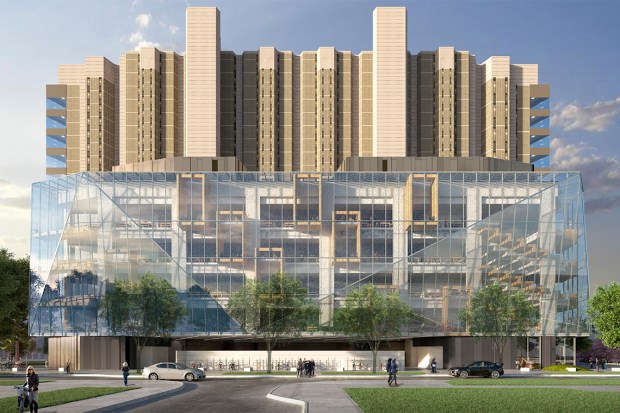
It does not take a trained eye to look at the original library building for one to realize that its massing is vertical, strained upward, and heavier on the top, giving the building an imposing and powerful impression, as if it has the strength to lift itself off the ground.
Under the claim of increasing study space by 25%, DSA decided to take the liberty to clothe the building in trademark corporate glass – but without the dignity or budget to complete the project, the University of Toronto settled on a glass diaper. Completely demolishing the dominant vertical regime and many existing symmetries (which the deeply geometrical design of the building depends on), the architecturally confused leadership decided to wage their war on history with the tools of trendy architecture.
But, this is not the end – to further undermine the Euclidean beliefs of the building’s architects, and as an illogical, cruel joke, they tacked on rectangular study carrels, to decorate the facade with the 90 degree angles that the building was apparently lacking – an act which is almost a war cry against any logic in architecture. To make up for their ignorance of the triangular theme, DSA decorated the diaper with large, oblong scalene triangles, a pathetic attempt which backfired by further sabotaging any intentions of symmetry. Although glass is a light material, the widening of the “base” of the building gives it the appearance of being squat and bottom-heavy.
To further validate this shameful act of cut-and-pasting from architecture magazines, DSA are planning to implement environmentally friendly technologies such as a green roof and a stormwater retention system, fully ignoring the fact that opening the entire surface of the building to the light and heat of the summer and the bitter cold of Ontario winters will incur drastic increases in the cost of heating and cooling. The original building, with a thick concrete body and only marginal window openings, performed well in these regards, even though the heating system may not have been sufficient since it can be slightly cool in winter months.
And here we are today, mistaking trends for progress. Do we take the behemoths from yesterday and encase them in our ideologies of today? The separation between 2017 and 1973 is simply not enough for the average human mind to grasp the monumental importance of what was built in the 20th century. We are what we leave behind, and in this case, it is massive fortresses of books that indicates our commitment to the quest for knowledge and the hegemony of the search for truth. Arbitrary erosion of symmetry and the imposition of light, airy, open spaces into a building whose aesthetic regime is opposite are not the manner in which U of T should demonstrate its wisdom and prominent position in academics. It is sad for me to see a building like Robarts to be disrespected in this manner, however it is indicative of the lack of public understanding about architecture and the built environment.
For now, we will have to study in the brazenly light, open spaces, and endure the glare and echoes for the sake of illogical aesthetic regimes, until we may retreat into our cosy nooks, our familiar spaces, our bedrooms and dark living rooms, where we can dwell comfortably.
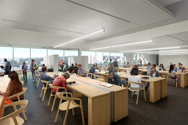
Somehow, the carpet and ceiling in this study space are even more prison-like than the original building. The interior design in here is an attack on the aesthetic tendencies of most sane human beings. Apparently, the architects convinced themselves that the lowest common denominator for inhabitability of concrete buildings was too much to ask for..
