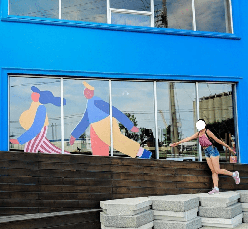
The development of Toronto’s eastern waterfront through a partnership of Waterfront Toronto and Sidewalk Labs has drawn much critique since its inception – it is a story I have followed closely as I know the area well, having travelled through it for one summer job, and actually worked directly next to it for another during the time I worked in water sports.
In the MIPD released by Sidewalk Labs the site is described as ‘disused industrial land’ or ‘mostly parking lots,’ which is confirmed by a widely distributed aerial image.

However, unlike this photograph suggests, the area is actually host to a variety of activities – it is home to a nightclub, a swanky pool bar, an extremely popular barbeque joint with excellent live music, a busy bike route, the stage grounds for the cirque du soleil. The admittedly depressing streetscape is often bustling with people trying to make their way to the windsurfing club or Cherry beach (there is, in fact, a bus line which services this area, but it is atrociously unreliable).
I am not trying to make a case for this area remaining the way it is – the activity is an indication that insightful design decisions, which are certainly needed, could be extremely successful in the area – but simply want to coax out an understanding of the complexity of post-industrial urban environments while examining the use of stand-alone images as marketing tools.
It was after a year of media inundation that I realized that I actually knew very little about the development, and that it existed in my mind solely as a collage of the images disseminated by Sidewalk Labs and the City of Toronto. The observation that architectural renderings, graphic design and a few token photographs make up the bulk of Sidewalk’s marketing strategy is not new, as is covered in excellent articles at Failed Architecture and E-flux, which discuss the dissemination and the utopian qualities of these images respectively, but is crucial to an understanding of this specific project and smart-city development as a whole.

While concerns about democracy and data privacy are undoubtedly more important, I remain fascinated by the images, phantasmagorias of scribbly lines, watercolours, Silicon-valley style vectors, doodles, pastoral renderings and atmospheric futuristic collages that dominate the discourse surrounding the development. These images are trying to resound with the every-day Torontonian, warming us up to the idea of having this neighbourhood in our backyard, but are also a tool to sell the smart city to investors, thus serving a dual purpose with entirely different end goals.
The characterizing feature of these images is a totalizing vagueness, found not only in the representation of the people on the site, who are red, purple and blue, with distorted physical features, but also in the landscape, the seasonality of which is indistinct, and in the geographic specificity, which often lacks regional markers and represents a project which could be anywhere (evident in the representation of contextual buildings as vague, white minecraft-like blocks) – a true “no place.” This lack of specificity ensures that no one is left out – demographically, but also ideologically – who could possibly object against neighbourhoods where children chase butterflies and pedestrians stop to smell the flowers?
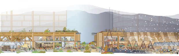
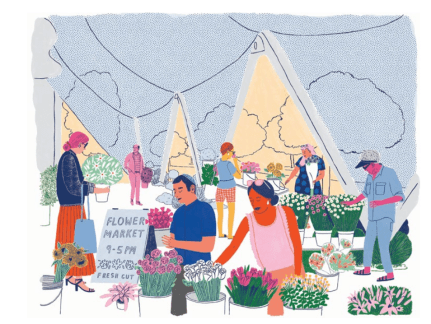
The second defining characteristic is the aestheticising tendency – the doodled, playful illustrations further the fantasy-like and utopian desires of the development as a whole, functioning as a veil that shrouds what is often a lack of architectural substance. The use of an illustrative style removes the responsibility of the architect to flesh out areas of design that have a direct and tangible impact on the success of the streetscape (the aspect with which these renderings are most often concerned), which include material, texture, longevity and resilience. Instead of an emphasis on the architecture, it is dematerialized, with pleasurable emotions and human connection becoming a stand-in. The dematerialization of architecture also resonates in the frequent use of sections, which, once again, are teeming with tiny humans, enjoying their colourful lives. In the section, the building becomes a skeleton, its bones existing merely as a reminder that we are, in fact, considering an interior.
The street-focussed nature of these images is also an attempt to shroud a central characteristic of the project, which is the fact that Sidewalk Labs is an experiment in total design, even without a central architectural figure or firm (there are many architectural firms participating). The non-existence of traditional architectural (infinite) viewpoints, with only the occasional abstract plan, and the focus on the streetscape is a poorly masked attempt to disguise what is essentially a Gesamtkunstwerk as organic and temporal.

A recently released axonometric shows the emphasis on streetscape even in a drawing which traditionally functions to emphasize massing – the buildings are speckled in green, with lush roof gardens and terraces pregnant with verdant shrubbery. This is a kind of drawing I am deeply familiar with, as I have personally participated in their creation – with the green space often serving as a tool to get the building approved by the city, when the budget never actually allowed for its realization. In the Quayside axonometric, the harbour is busy with sailboats, while ant-like people mill about on the street. While the buildings only have vaguely-fleshed out details, the planting and public amenities are precise and intentional – the streetscape is a playground for those visiting the waterfront in a marked contrast between public and private.
When this drawing is compared to earlier axonometric drawings, this potentially dangerous shift of focus is evident.

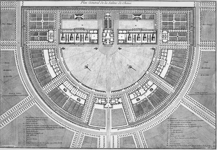
This type of development is also informative when considered in light of the tradition of master planning, as illustrated in the plans for the royal saltworks at Arc-de-Senans, by Ledoux, which show a centralised, totalitarian layout from an impossible viewpoint, highlighting the formal geometric moves of the facility.
The de-emphasis of formality, geometry, symmetry and even architecture itself in contemporary masterplans is symptomatic of a desire for abstraction, for complexity and humanity – the inherent chaos of being a human being, which is mirrored in the squiggly lines and flowing pigments of the illustrations which accompany the schematic designs.
Instead of the lofty aerial viewpoint, these images are participatory, and we feel like we could jump into the scene, perhaps flying a kite, petting a dog or frolicking in the snow. The totalitarian eye of the developer is replaced by the gaze of the onlooker, which observes a streetscape mired in chaos and complexity.
While I believe that traditional architectural representation has immense shortcomings in its ability to address many aspects central to architectural, urban and landscape planning, these drawings only feign to address the messiness of urban life and what it is to be a human being in space, and upon closer inspection are actually effete and empty containers which reflect back only a collective utopian desire. This masking of the reality of architecture and urban planning – walls, streets, windows and materials is a sort of dishonesty which is less likely to exist in traditional architectural representation – the plan of the saltworks cannot disguise its totalitarian and surveilling intentions, while a city designed entirely by a company notorious for surveillance with extensive plans to collect data on the inhabitants of said city intentionally uses obscuring representation techniques to mask exactly these connotations.
Images are powerful and they haunt the collective imagination, especially those of utopian smart-city developments, through which we can dream about an inclusive, fair and exciting future, as Michèle Champagne aptly demonstrates. When we carefully pick at the strands of the PR strategy of Sidewalk Labs, we reveal a tangle of architectural representation, of corporate marketing, of politics, of desire, of history and of hierarchy. We run into a head-on collision between the messiness of architecture and the clean digital utopia of big tech companies, leaving us wondering whether the differences of the world of cigarette butts and earthworms and lichens and decay can ever be reconciled with our clean-cut vector dreams.